For more information on these CSS (Cascading Style Sheet) web standard consult W3C CSS Recommendations for further information.
To begin this process without embarking on the making of a full layout (Like I did for the XHTML tutorial). Lets open up ImageReady CS, start a new document of any preset size.
Next, go ‘Window/Actions’ to bring the Actions Palette to the foreground, if it isn’t already.
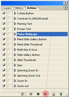
Now, create a simple layout from a ‘Make Website’ action preset from the actions list.
Activate the ‘Make Website’ then hit the ‘Play’ action playback button on the bottom of the Actions Palette, as I have captured below.
Note: Make sure you have a blank document open as mentioned earlier, otherwise you will be prompted with a serious of error messages related to the action.(Which requires to be run on an active document)
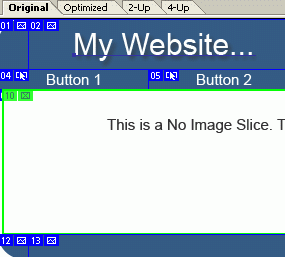
Once the ‘Make Website’ action is finished, you should have a document like the capture below.
Click above image for a larger view!
Click above image for a larger view!
This action creates a ready made layout design, complete with 2-state roll-over navigational buttons and with slices. (As indicated by the blue/green border areas)
This is a preference item that has to be set before you go to the ‘Save Optimized As’ command feature.
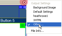
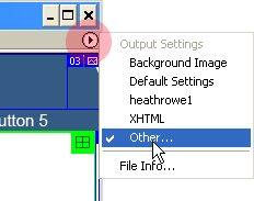
To locate this preference, go to the far upper right of the ‘Optimized View’ document window, and click the ‘Output Settings’ menu button (Highlighted in Red below), and from the list choose ‘Other’. (Notice I have my own output settings in the list ‘heathrowe1’)
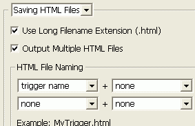
Hit the ‘Next’ button on the right to go to the ‘Saving Html Files’ preference (As captured below), and the option to ‘Output Multiple Files’ is what produces the above extra navigational bottoms on the fly.
Note: Untick the ‘Use Long Filename extension (*.html) will generate just the three letter .htm file name extension on output.
Hit the ‘Next’ button until you get to the ‘Slices’ options. Then simply, then simply activate the ‘Generate CSS’ feature, choosing one of the three style options(ID, Inline, By Class). (As I have captured below)
I recommend the by ‘Id’ or ‘By Class’ options so that when you get to your html editor you can easily copy the entire style to an external style sheet file.
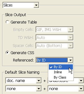
Now with this feature active, the next time you go to ‘Save Optimized As’, ImageReady will include all the necessary .css style information embedded into your html file.
Below is a brief comparison of choosing ‘Generate Table vs Generate CSS’:
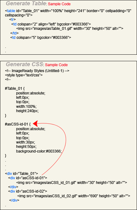
As the above indicates, the ‘Generate Table’ option produces the standard Table/Td/Tr tags to the layout scheme based on the template slice positions.
‘Generate CSS’ however, does not use the table/td/tr scheme, but a div tag with the appropriate id element (indicated by the red arrow) for the assigned css style.
It’s not perfect, and theres a lot to consider when building a totally css driven site, which is why I pointed out the W3C Specification link above. But certainly, a quick way to migrate a tabula layout to css style layout.
If you viewed this action preset web page layout in your default browser with the ‘Generate Table’ option activated, everything appears as it should.
But when you activate the ‘Generate CSS’ option, not everything falls into place at should appear in the ImageReady Preview window.
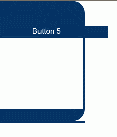
This occurred only due to the nature of how this action driven Create Web page was built. I quickly fixed this problem by going to the ‘Table’ Palette and changed the ‘W’ (Width) parameter from ‘Percent to Pixels. (This fixed the top overlapping Blue Band)
To fix the bottom overlapping blue band, activate the ‘Slice Select Tool (O)’ and double click each of slices number 12/13/14 (respectively) and from within the ‘Slice Palette’ (which should appear to the foreground upon double clicking the slice) and change the ‘Background Color’ parameter from the default dark blue to ‘None’.
Simply, go back to the ‘Output Settings’ menu command and choose ‘Other’, as I have captured.

Again browse (hit the ‘Next’ button, to the ‘Slices’ area and activate ‘Generate CSS’.
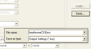
Then to the right of the panel, hit the ‘Save’ command, and upon prompt give it a user friendly name as I have captured below. (Example heathroweCSS.iros) This should prompt you to the default ‘Output Optimized Settings’ folder.
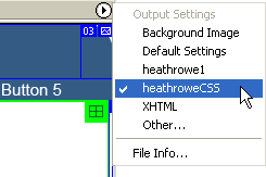
Note: Make sure to change the ‘Output Settings’ from your ‘Custom Name’ preset to ‘Default’ for future layouts that don’t require it.
Note: The ‘heathrowe1’ preset in the list combines the above .css settings as well as the xhtml settings to achieve both XHTML Transitional & CSS standards.
Additional CSS resources woth exploring:
The Web Standards Project
A List Apart
