Adobe Edge Preview 4: Feature Overview
Download Adobe Edge Preview 4 from Adobe Labs
Symbol Creation and Management
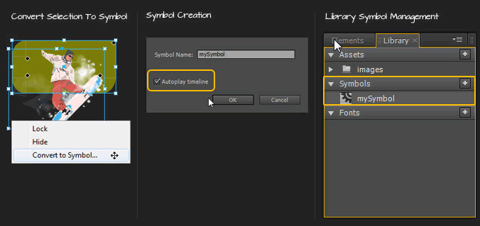
Similar to Fireworks, Illustrator and Flash workflow, Adobe Edge now allows for the creation and management of Symbols.
- Select Elements: select element(s) on the Stage, Right/Option Click and choose ‘Convert to a Symbol’; Alternatively, go to Modify > Convert to Symbol or Ctrl/Command + Y;
- Name & Autoplay: name the new symbol, with optional ‘autoplay’ and click OK;
- Manage: view created symbols via the Window > Library Panel;
Symbol: Edit In Place
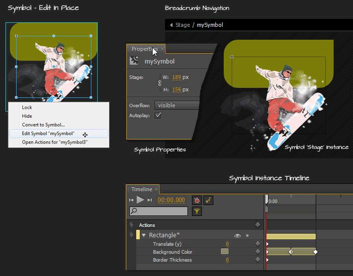
Along with the Symbol creation and management we also have Symbol ‘Edit in Place’ mode.
- Edit in Place: double-click directly onto the ‘stage’ symbol instance to enter ‘Edit in Place’ mode. In this mode the rest of the stage elements is ‘crosshatch patterned’ (view-only) with only the symbol instance elements editable;
- Breadcrumb Navigation: at the top of the ‘Edit in Place’ mode, you can navigate back to the stage through the breadcrumb navigation;
- Symbol ‘Stage’ Instance: much like the main ‘Stage’ symbol, a symbol instance has its own Width, Height, Overflow and Autoplay properties.
- Symbol Instance Timeline: exclusive to the core Timeline the Symbol Instance has its own Timeline and access to the all the other core Edge features;
Symbol Playback “Actions” & Scrub
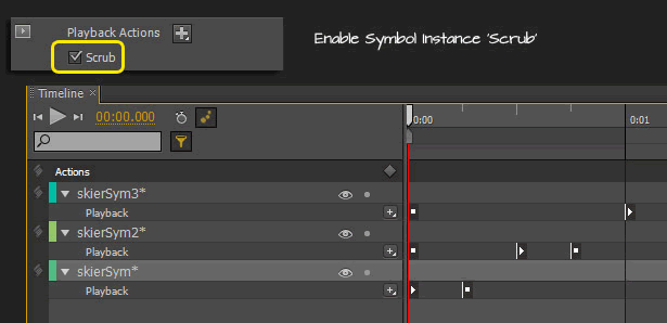
These can be accessed from the CPP (Contextual Properties Panel) for an active Symbol instance and provide a stremlined visual approach to the symbol lookup.
- Playback Actions: provide quick playback ‘trigger’ stop() and play() commands on the select symbol instance.
- Scrub: provides a preview of a symbol instance during playback on the stage Timeline.
[divider_top]
Web Fonts
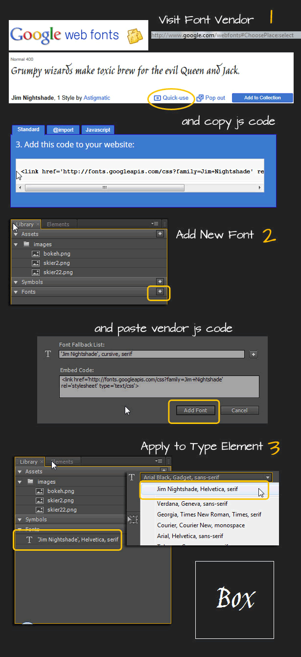
The ‘Library Panel’ allow you to add Web Fonts and define the ‘Font Fallback List’. Once added, the font fallback list appears in the list of available fonts when styling text objects.
To add to the Font List:
- Visit a webfont vendor and copy the required JavaScript code (I sampled Google); Google (http://www.google.com/webfonts#HomePlace:home) Type Kit (https://typekit.com/) In my use case I visited the Google Web Font collection. Locate a choice web font and click the ‘Quick Use’ link. Then copy to the clipboard the ‘Standard’ link reference.
- In the ‘Library Panel’, click the ‘Add Web Font’ icon command and paste the previously copied JavaScript code into the ‘Embed Code’ field; in the ‘Font Fallback List’ field start with the ‘font-family’ name from the original vendor (in my case it ‘Jims Nightshade’) followed by a fallback list, separated by comma.
- Select or create a new Text element and choose the new web font from the Properties Panel;
To Remove a Web Font:
- Select it in the Library > Fonts section and hit the Delete key; once removed stage elements that rely on the web font will revert to the default Edge font-family;
Element/Shape Clipping
You can now create a static clipping region relative to the elements shape or track its clip values as keyframe transitions; ideal for show and hide when elements occupy the same space in the element tree, navigating image sprites, or for advanced swipe effects.
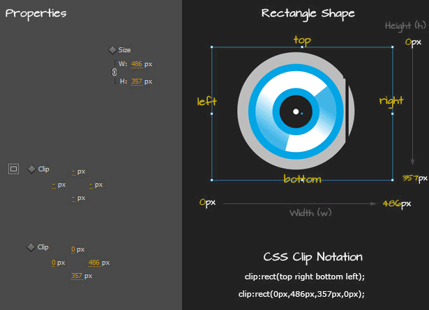
- default is ‘auto’ (example, clip:auto;), meaning no clipping occurs;
- clipping occurs on the rectangle area/bounds of an element from the top, right, bottom and left;
- the clip values represent offsets measured in pixels from each respective side of the element;
[divider_top]
Clipping Groups
Now that we have the ability to nest elements, the parent element can clip its containing child element(s).
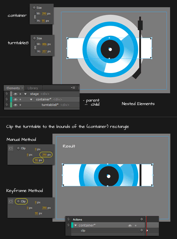
As captured above, to clip child element(s) of the parent:
Manual Method: select the parent element (in my case ‘container’); adjust the right, bottom clip values to match its Size: w & h values. Ideal for clipping element(s) that does not require transitions.
Key Frame Method: select the parent element; then click the ’Add Keyframe for Clip’ icon command in the Contextual Properties Panel. It will auto populate the clip values right, bottom and add a keyframe at the playhead position on the Timeline.
To Remove Clip
- Right/Option Click the element and choose ‘Remove Clip’ from the context menu list;
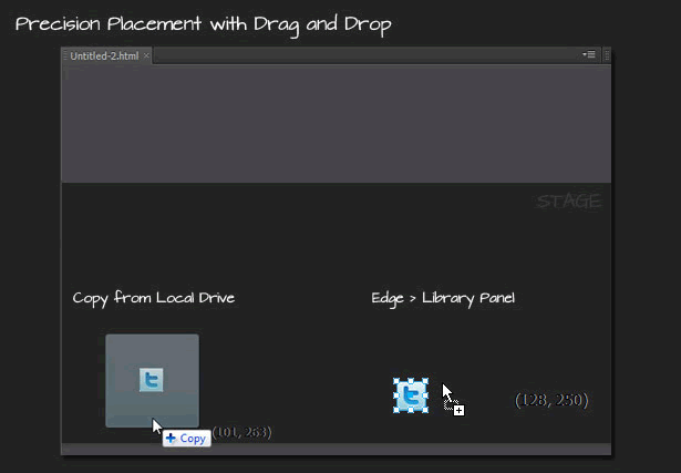
Drag and Drop Capability
You can now drag assets such as images from the file system or Library Panel at a specified location on the Stage.
- if dragged from the file system, the asset is copied to the project /images folder and the Library > Assets Panel;
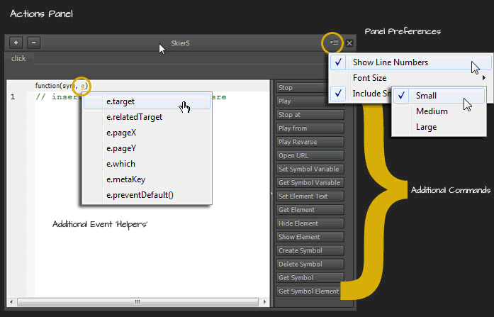
Actions Panel
The ‘Actions Panel’ has some additional command shortcuts; panel preferences; as well as, some exposed event triggers.
[divider_top]
Toggle Element Display
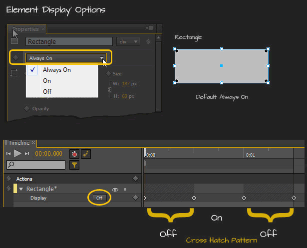
Select an element on the stage and the Properties Panel will have a new ‘Display’ property option: ‘Always On’, ‘On’, ‘Off’.
- By default, elements are “Always On”.
- Setting either ‘On’ or ‘Off’ will append a ‘Display’ type keyframe to the Timeline at the position of the ‘Play head’.
- Setting display to On, at a given point will cause the object to initially be “Off” which is equivalent to display=”none” and then set to visible.
- Elements set to ‘Off’ (display=” none”) are removed from the HTML rendering tree and lessen their overhead. In previous builds toggle an elements visibility was still rendered in the final html output.
- Objects set to “Off” are visualized in a crosshatch pattern, which makes it easy to see when they’re active, ass captured below.
Transform Tool
The Transform Tool (Q) allows you to scale objects on the stage as opposed resizing them. Resizing with the selection tool is not affected by the transform origin.
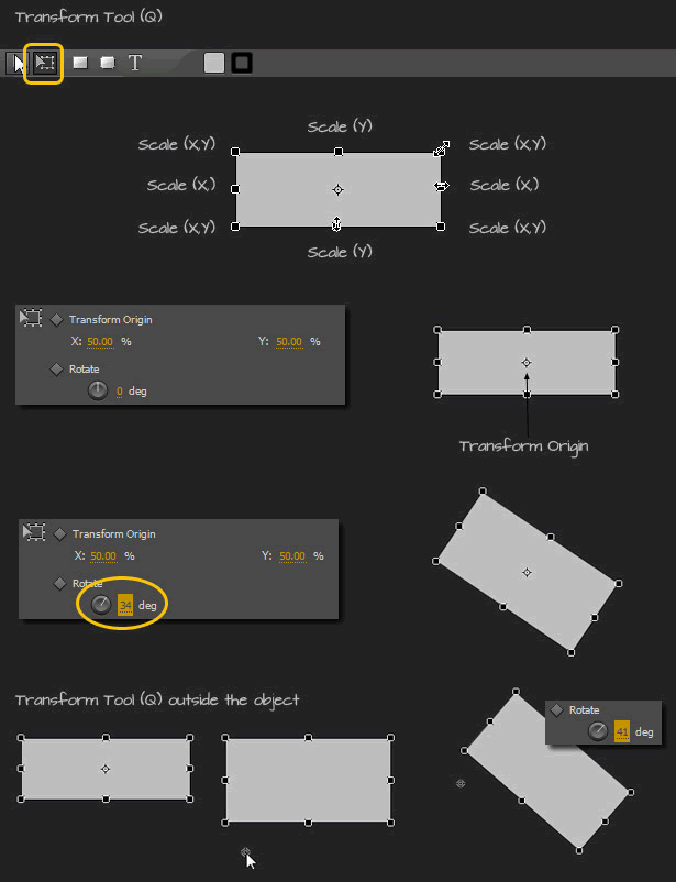
As captured above, to ‘Transform’ an element on the Stage, simply:
- Drag any of the four corner handlers (anchors) to Scale x,y;
- Shift + Drag any of the four corner handlers (anchors) to constrain the transformation proportionally (x,y);
- Drag the left/right handlers to Scale x (horizontally);
- Drag the top/bottom mid handlers to Scale y (vertically);
- Drag the ‘Transform Origin’ anywhere (even outside the element bounds), ideal for circular or perspective transformations;
The ‘Transform Origin’ affects the Rotate, Skew, and Scale properties of an active element, unlike the Selection Tool (V) which operates on the Location x, y, and Size w,h.
[divider_top]
Color Tools
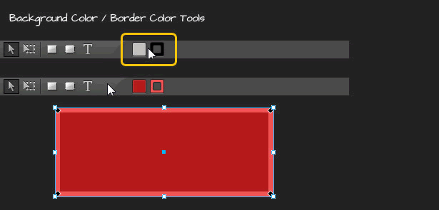
Background Color and Border Color Tools are located directly on the main Toolbar.
- Background and Border Colors can be configured BEFORE the creation of the actor object;
- Does not apply to the Stage, Text or Image objects;
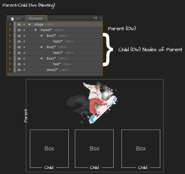
Parent/Child Divs (Nesting)
Element management gets a lot easier with an added capability for nesting divs. As captured below I created a ‘parent’ div (with just a border, for demo purposes), containing an image graphic and three child (nested) div containers. Each ‘child’ div contains its own elements. In my case just a text element.
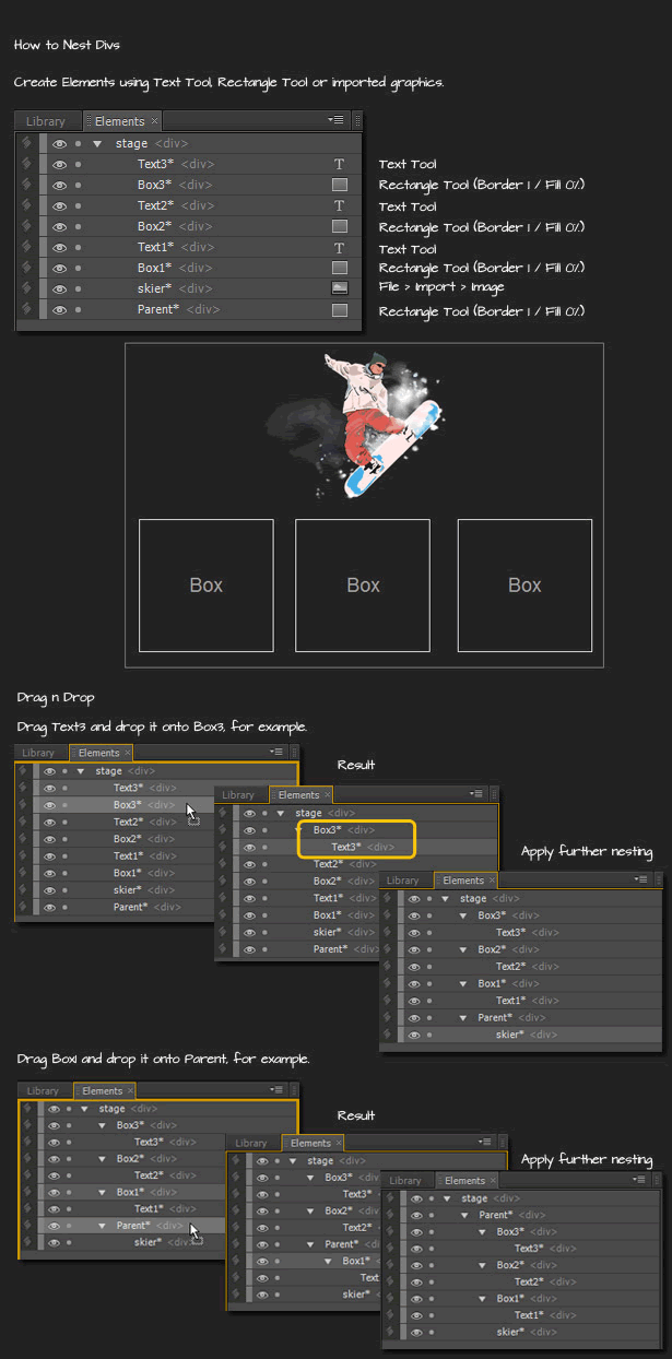
To create nested divs:
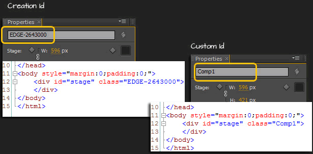
Composition ID
The composition ID, used as the class name in the host HTML file for the target DIV, is now easily editable in the stage properties of the composition.
[divider_top]
Simplified Script Include
The amount of code needed to embed in the host HTML page is now reduced to a single line of code.

Download Adobe Edge Preview 4 from Adobe Labs

