Here’s a few simple steps to achieve a background knockout on an image in which the background is a solid color.
Photoshop offers plenty of ways to achieve this same affect through various Toolbar tools and Layer Masking techniques. Each technique is most advantageous depending on the complexity of surrounding pixels separating the target knockout object and the background. (Primary examples include use of and combinations of ‘Extract Filter’, ‘Selection Tools’, ‘Pen Tool’, ‘Layer, Vector, Quick & Alpha Channel Masks.)
But for the sake of a quick solution and a no fuss alternative to applying options bar settings per tool, there is a handy technique directly within the ‘Blending Options’.
Follow along, and I’ll show you how. (Download original chair.psd file here.)
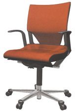
Below, is the target image I scanned in from a magazine. The idea is to knockout the white background and separate the chair unto its own layer for further use in your design or graphic work.
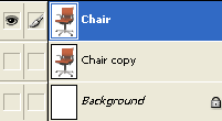
- So begin by opening the image, rename the original scan layer to a user friendly name. (I named it ‘Chair’. Also duplicate it for backup purposes. Which should default to the name of ‘Chair copy’.) and hide the background layer, as I have captured below.
- Next with, the ‘Chair’ layer active, right-click (Mac: Control click) and choose ‘Blending Options’ from the context menu commands, as I have captured below.

- Next, at the ‘Blending Options’ control panel, move down towards the ‘BlendIf’ ‘This Layer’ option, and adjust the far right upward arrow control slider to the left. Keep nudging(by dragging it) it until you can see that the white background in the canvas view disappears.
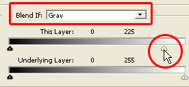
In this particular case I dragged the white slider to a value of 225. Which basically means that brightness values higher than 225 will remain unblended and will be excluded from the final image.Note: The blended pixels is measured on a scale from 0 (black) to 255 (white). The Blend If ‘Gray’ option specifies a blending range for all the channels. (In this case its an RGB image, so that corresponds to all the pixel information for each of the ‘Red, Green & Blue’ channels.)Click OK to commit the changes of the Blendings Options panel. Below is the result.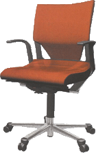
Thats basically it. Just another way to knockout a solid color. Handy for scanned images.
Soften the transition of the Blend If Effect:
If your background area contains variations in color/texture or the above method creates a fringe halo to the edge of the target object (this case the chair). Then you can further control the blend range by softening the transition.
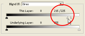
Simply, hold down the ‘Alt’ key + click (Mac: Option key + click) on the arrow slider, to break it into halfs. As I have captured below. Notice the slider control is now diveded in two and the pixel rage to adjust the blending is now bewteen those two areas. This case 215/225. (Encircled in red)
What are the visible clues after using the Blend If Effect?
Also, if you use this method, it can be difficult to tell if a layer has this ‘Blend If’ feature in use. Becuase, unlike the other ‘Blending Options’ parameters it leaves no visible nested Layer Style attached to the layer.(Ie, Stroke, Bevel & Emboss, etc.)
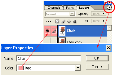
So as an option, Color Code the active layer by going to the ‘Layers Palette’ menu command to the upper right, choose ‘Layer Properties’ from the list, and select a Color to Color Code the layer that contains the hidden ‘Blend If’ feature. (Ie, I used ‘Red’, as I have captured below)
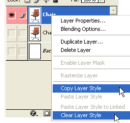
There is a visible clue that such a Blend Option exists, even though there is no apparent visible nested layer style (Ie. Stroke, Bevel & Emboss, etc.), but when you right + click on the Layer and from the context menu options you will see two options : namely ‘Copy Layer Style’ & ‘Clear Layer Style’. (As captured below)
Also returning to the Layer ‘Blending Options’ panel keeps intact the ‘Blend If’ options set earlier. Yet, still hidden from the Layers Palette, so I recommend to color code that layer as a visible reminder.
How can apply further Layer Styles after using the Blend If effect?
After using this simple ‘Blend If’ knockout effect, you will proably realize that using any other of the ‘Layer Styles’ still only applies to the document as if the knockout has never occurred. As captured below, I tried applying an ‘Inner Shadow’, to the chair object but it was applied to the entire document boundary.
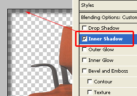
What you see in the Layers Palette thumbnail view and what you see in the document view, don’t quite corelate either! As captured below, the thumbnail view still shows the white background, while the document view reveals transparency , as achieved through the Blend If option.
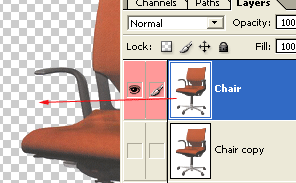
So what the heck is going on? The truth lies in the ‘Channels Palette’. Click the Channels tab and you should see the same result as below. This is the REAL visible clue to bear in mind when using ‘Blend If’.
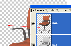
Now it makes sense. Its really quite a sophisticated mixture of applying Layers style effects directly to the Layer through Stroke, Bevel & Emboss and so for and a ‘Blend If’ option to apply to the channels all in one Blending Options panel.
The moral of this end note is the ‘Blend If’ effect applies to the channels, and as mentioned above selecting the ‘Gray’ option applies to all the channels. The moment the high and low sliders are adjusted for either ‘This Layer’ or ‘Underlying Layer’ its effecting channel pixel information not the layer pixel information. Hense thats why applying any other layer style didn’t go directly to the ‘Chair’ object.
So how do you combine Layer Styles (Stroke, Bevel & Emboss…) & Channel (Blend If) options onto a single layer?
Here is a quick solution: Cancel out of any attempted further Layer Style. Go back to the ‘Layers Palette’, and create a new empty Layer, by hitting the ‘Create A New Layer’ icon on the bottom of the ‘Layers Palette’ or Shift + Ctrl + N (Mac: Shift + Command + N) and place it directly above the ‘Chair’ layer as I have captured below.
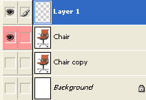
Then with that new ‘Layer 1’ active (hightlighted in blue in the above screen capture), hit the ‘Ctrl + E’ (Mac: Command + E) keys to merge the actively selected layer (Layer 1) with the one below it. (‘Chair’ layer)
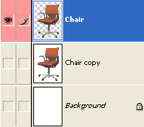
As captured above, with the merge process, the ‘Chair’ layer now has the transparency, and still has the ‘Blend If’ option intact, whereby you can combine further layer styles to the chair object only.
